Tuesday 28 February 2017

Final Magazine with commentary


This is my final media product, a rap magazine that includes a front cover, a double page spread and a contents page. I have added high quality pictures of my own, and included more content from my last draft. The progress made between my draft and my final product is very high as I have used more elements.

Front cover:

Masthead - The masthead is the largest text in the magazine cover which instantly grabs the reader's attention. I have utilised a more conventional font type which appeals to the target audience and connotes rap music even better. The graffiti nature of the font type suggests a 'street' culture which is related to rap music. The masthead is conventional to my rap magazine because it identifies the music genre instantly, and stands out to the target audience. 

Strapline - The strapline appeals to the target audience as it makes out the artist to be a 'rap sensation' which interests the reader. They will want to know who is this new artist and will be flicking through the pages. It is conventional to a rap magazine because it relates to rap music. 

Colour scheme - I have used the same colour scheme that was in my double page spread draft. The colour scheme applied suits my images even better. The red, white, black and yellow all combine to stand out to the reader and they all appeal to the audience. They yellow used on the main cover line injects energy with the artist's name, and the target audience are intrigued by this. The red colour also serves as a point of attraction as it is normally associated with stylish things. The black colour which is also used further stands out because it is alongside the white and red. The house style is made evident and is carried throughout my music magazine, which implants a persistent and professional element to my magazine, which the audience can recognise. The house style that I have deployed will allow the audience to become familiar with 'Rap Sensation', through the colour scheme, the location of the masthead and image, and other layouts of the conventions.

Main cover line - The main cover line announces the artist's name which immediately appeals to the target audience as they become interested at a rap star. The main cover line is conventionally the second biggest text in the front cover after the masthead. This is because the audience will become instantly aware of the magazine's main focus, which is a new rap star and this is conventional to my magazine. It will appeal to my target audience as they will be looking for different rappers due to their interest in rap music. 

Cover lines - I have added more cover lines on the right side of the image, which further gives information to the audience about the content on the magazine. My main colour scheme is used in the cover lines, where each word is a different colour and this is effective in grabbing the reader's attention. The font type of the cover lines is a sans-serif Roboto which allows the reader to easily read it. The layout of the cover lines is conventional to my magazine as it informs the audience about the content inside the magazine, and is appealing to them. 

Main image - The main image has changed from my previous draft, as I have now taken my own images. The main image is of the magazine artist, and he is a representation of my ideal reader which the target audience can immediately identify with. This appeals to them, as they will notice the details about the main image, which takes up most of the front cover. The image is the first thing the audience will notice, and this is conventional to my rap magazine as it is of a rap artist who addresses the audience by looking into the camera. This appeals to the audience as they will feel intrigued by the main image, who is representing my target audience. The main image anchors over the masthead which emphasises the importance of the artist and the audience recognise this. The magazine is recognising the artist as a main focus, which is why he anchors over the title, as it wants the audience to know this is a big deal.  

Puffs - I have included two puffs in my magazine cover which is effective as it makes the content in my magazine stand out. It appeals to the reader as they become aware of 'free'  features inside of the magazine, consisting of a 'free CD voucher' and '4 posters'. The idea that the audience will get something free if they buy the magazine, appeals to them and encourages them to buy the magazine and profit as well. This is conventional as the target audience are gaining from the rap magazine and the puffs are texts put into a shape which stands out to them.

Skyline - The skyline of my magazine is a black border, with simple information which they target audience will be able to recognise. This will appeal to them as it makes the rap magazine look prestige, as the simplicity promotes rap music. The skyline is conventional to my magazine, as most magazines have a skyline which contributes to the house style.

Date, Barcode and Price - The location of my barcode, date and price was moved to the left side corner as I felt it would be more conventional to the genre. The price of my magazine is £4.99 based on the results of my questionnaires, which met their wishes, and also maximises profit for my magazine. The date is also located next to the price on the barcode. 


Double page spread:

Colour Scheme - The colour scheme is continued from my magazine cover which keeps a consistent style for my house style and this appeals to the audience as they will feel that this is a prestigious magazine. The questions in my interview are red, and the answers are in white which is evident to the reader and easy for them to read the interview. The main cover line is in red, and there are red banners at the top and bottom of the left page. The pull quote is also in red, as well as a pug on the right corner and the choice of colour allows for a stylish look, which lures the reader. 

Main image - The main image has been added from my previous draft, which informs the reader who the interview is about. The artist is smiling, which sets a feel good factor for my interview, and further appeals to the audience to read it. The image connotes a 'street' lifestyle because of the background and the target audience will be appealed they will be able to identify with the image. The main image is conventional to my rap magazine, as it is located on the right hand side of the page, and it takes up the whole page which stands out for the audience. 

Pull quote - Following my draft for the double page spread, I have now included a pull quote which is conventional as it directs the reader to the main interview. The pull quote attracts the target audience, as it is a unique phrase from the text on the left hand side, and it encourages them to read the interview. The pull quote is located at the top of the page, which associates the main image with the quote and this further appeals to the audience. 

Text - The text has not changed from the draft and is located on the left hand side of the double page spread. This is conventional to my rap magazine as people traditionally read from the left hand side and this appeals to the target audience because they are not put off by the structure. 

Gutter - The gutter is also the same as my draft which is conventional because it structures the interview and appeals to the target audience. This is because the interview is presented as very neat and professional and makes the magazine look classy. The gutter is the same between all three columns of the text and this makes it look straightforward, and a quick read for the audience.

Drop Caps - The drop caps have remained from the draft which appeals to the audience, as it makes the interview seem classy and prestige.

Pugs - The pug on the top right corner of the double page spread has also remained because it appeals to the audience as it is building further excitement for the interview. 

Page Number - The page number is  still located in the bottom left hand side and the bottom right hand side of either page. This is highly conventional to my rap magazine, as most magazines use the same layout involving the page number.

Title - The title is of the artist's name which puts the focus on him. This makes the artist seem authoritative and prestige due to the simple title which will interest the target audience. The title is the biggest text in the double page spread which grabs the readers attention. This is conventional as it makes clear for the audience the topic of the interview, which is the artist in this case.

Sub-heading - The sub-heading boasts an exclusive interview with the magazine artist which interests the reader as they will wonder why they are so hyped. 


Contents page:

The progress between my draft and the final contents page is evident as I have included several more elements to make it more conventional to a rap magazine.

Main cover line - The main cover line is conventionally located at the centre of the page and at the top. It is the biggest text which is conventional because it identifies what page it is on the magazine. This appeals to the target audience as they will understand where they have to look to gain information about the content of the magazine. There is black border underneath which allows the audience to see the main features and the month of the issue date. 

Main features - The main features direct the audience to the key content in the magazine which they will be appealed to. The page number, the title, and the sub-heading is well structured as it clearly identifies to the audience the main features. The main features is conventional to my rap magazine because it steers the audience to the magazine's content which appeals to them. 

Images - Following, my draft, I have now included my own images which makes the contents page more conventional to a rap magazine. The image which is located underneath the main features is conventional as it further emphasises the magazine's main artist. The contents page is a page the audience are likely to go to, and it is important for an image of the magazine artist to be there, in order to attract them. The image is fairly big and is well structured underneath the main features. This appeals to the audience, as they will be aware of the magazine artist and will read the main features which will interest them. As well as this, I have included an image of another artist on the right side of the page, and underneath the main features. I have included an image of another featured artist in the magazine underneath the editor's message. All these different images communicate to the audience the different types of artists and allows them to gain more knowledge about the magazine. 

Colour scheme - The colour scheme is continued, black, white and red. There is no yellow colour here which is used for the artist's name, but in this page he is not mentioned in a main cover line. 

Editor's message - On the right hand side of the contents page, there is an editor's message which is thanking the audience for their support. In this contents page, there is a lot of communication with the rap magazine and the target audience. I have included another message underneath the main sticker which invites the audience to join a competition via the magazine website. This promotes the website as well as appealing to the audience as they can win a chance to meet the magazine artist. As well as this, the final message at the bottom of the page announces a surprise in the next issue which will keep the audience engaged and eager to find out. 

Page Number - The page number is conventionally located at the bottom left of the page inside the red border. This allows the audience to clearly identify the page number.

Website - The magazine website is located at the top right corner inside the red border which promotes the magazine's website as the audience can easily notice it.

Date and Price - The date and price is also located at the bottom border once again to give the audience further details about the magazine.

In conclusion, I think my magazine is conventional for rap music as I have applied the right codes and conventions, which will be recognisable for my target audience. I researched the different codes and conventions in other rap magazines, which allowed to identify the required codes and conventions in my rap magazine to target black male students. For example, I found out that the main image is a key convention in rap magazines, and that the rappers have a certain look which I reinvented in my main image. As a result, the main image appealed to my target audience, as they can immediately recognise a rap artist.


Sunday 5 February 2017

Magazine Drafts


I have produced my first draft for my magazine cover, double page spread and contents page. I still have a lot of requirements starting from taking my own original pictures and including several elements on the magazine. I have not included a skyline and there are missing cover lines in my magazine cover. The image on my magazine cover is of an audience rap idol which is a leading point for when I take my own images. 

Front cover:

Masthead - The masthead is conventionally situated at the top of the magazine cover. This allows the target audience to instantly recognise the name of the magazine and become aware of the sub-genre. 'Rap Sensation' is the largest font on the cover which emphasises its importance as it is the first thing the audience will notice. This appeals to the audience as they will feel that the masthead is demanding them to read the magazine.

Colour Scheme - The colour scheme of black, yellow and white sets a luxurious tone as they stand out and connote jewellery. The colour scheme is similar to a 'Hip Hop Connection' that I analysed which attracts a similar target audience. The colours are conventional to rap music as it is known to promote this type of lifestyle, involving jewellery and luxury. The colours also directly appeal to a male target audience as they are normally interested in these types of colours, which are distinctive in a dark background. I have not finalised the colour scheme as my images may not blend as well as the image used in the draft.

Main cover line - The main cover line is of the artist's name. This is effective in presenting to the audience the main focus of the magazine, which will appeal to them as they will be interested in a new rap artist. 

Cover lines - The cover lines highlight the main content inside the magazine which is conventional to a rap magazine. This appeals to the audience as they will be notified about the content and will thus be interested. I still have to include more cover lines to further attract my target audience as it will notify them about more content. 

Puffs - I have included a puff highlighting a 'free CD voucher'. This appeals to the audience as they will be interested at the prospect of a free feature which will encourage them to buy the magazine. This is conventional to a rap magazine, as puffs highlight a special content that is included, which will relate to the target audience. In this case, they will be interested in a free CD because they follow rap music. I can still include more puffs to further grab the audience's attention.

Skyline - I have not included anything in the skyline, but I intend to do so. This will be conventional to a rap magazine as it will identify some of the main content in the magazine which will be appealing to the target audience.

Main Image - I have taken an image from the internet, which will serve as a leading point for my own images. The image is conventional to a rap magazine as it is of a famous rap artist, which the target audience will be able to identify instantly and will be appealed to it. The main image is supposed to be a representation of my ideal reader, which is something I will try to do in my own images.

Barcode - The barcode is located in the bottom right which is conventional to any music magazine as the audience will instantly identify it. This will appeal to the target audience in presenting the issue date, and the price which is something they will look far when trying to buy the magazine.

Font type - I have to deploy a different font type which will better connote rap music and appeal further to the audience.


Double page spread:

Colour Scheme - The colour scheme in my double page is different from my magazine cover. This is because I felt  a black background will not attract the audience to read an interview. I will have to change my magazine cover to suit my double page spread in order to deploy a consistency for my house style. The colour scheme of red, black, white is more stylish and is conventional as it deploys a 'swagger' which is associated with rap music. This appeals to the audience as the colours will lure them to read the text. 

Text - The text is located on the left hand side of the double page spread which is conventional because people traditionally read from the left. I have left a blank space on the right side for my image which will show the audience who the interview is about and will appeal to them.

Pull quote - I need to include a pull quote to further entice the reader with a key phrase which will appeal to the audience.

Gutter - The gutter which I have deployed allows for a tidy presentation of the interview which appeals to the audience, as they are not put off by the text. The gutter is conventional as it creates a sense of professionalism and makes the magazine look classy. There is also a red banner at the top and bottom of the left page, which makes it look more compact and neat.

Drop Caps - I have included drop caps at the start of each question to further inject an elegance about my double page spread.

Pugs - I have included a pug on the right hand side corner to tease the reader about an upcoming event involving the artist. This appeals to the audience as they will be even more interested. 

Page Number - The page number is located in the bottom left hand side and the bottom right hand side of either page. This is highly conventional to my rap magazine, as most magazines use the same layout involving the page number.

Title - The title is of the artist's name which puts the focus on him. This makes the artist seem authoritative and prestige due to the simple title which will interest the target audience. The title is the biggest text in the double page spread which grabs the readers attention. This is conventional as it makes clear for the audience the topic of the interview, which is the artist in this case.

Sub-heading - The sub-heading boasts an exclusive interview with the magazine artist which interests the reader as they will wonder why they are so hyped. 


Contents Page:

Main cover line - The main cover line is conventionally located at the centre of the page and at the top. It is the biggest text which is conventional because it identifies what page it is on the magazine. This appeals to the target audience as they will understand where they have to look to gain information about the content of the magazine. 

Main features - The main features direct the audience to the key content in the magazine which they will be appealed to. 

The house style is continued on from the double page spread. I have included a banner at the top and bottom of the page as well. The colour scheme is also continued from the double page spread analysis, which is something that I will utilise in my final magazine cover to deploy a consistency throughout. There is a message from the editor which appeals to the audience as they will feel involved and will be encouraged to buy more issues. 

I need to include my own images in the contents page to make it more conventional and appealing to the audience. I will also add more content .


Friday 3 February 2017

Double Page Text - Draft

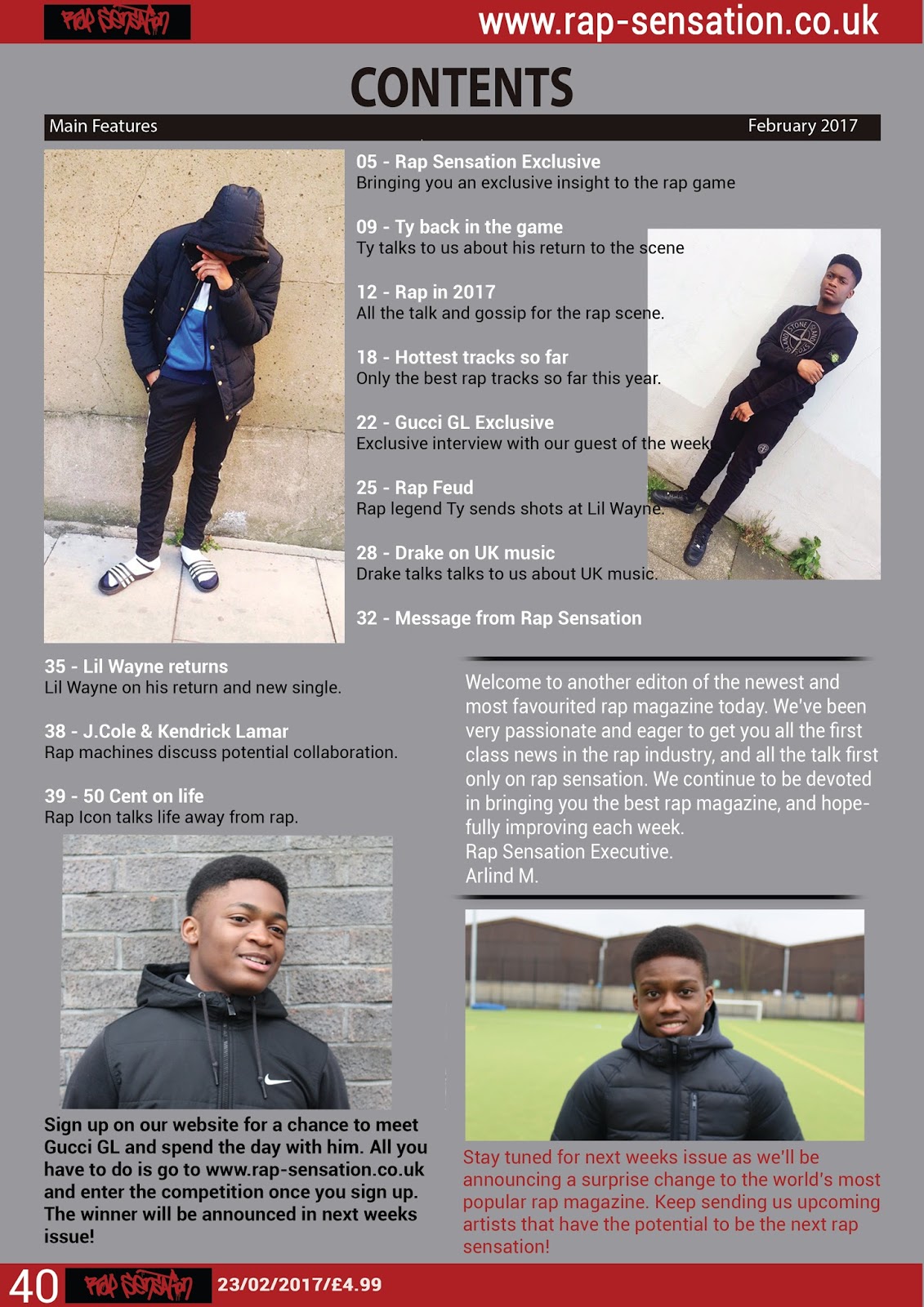
Exclusive interview with new rap sensation ‘Gucci GL’!

You’re the hottest rapper in the game right now Gucci, where do you rank yourself among other rappers over the years?

Rap music has changed over the years and the different rappers have all been suited to the particular era. I wouldn’t be able to do what I do, say, ten years ago. The rap of today would be laughed of ten years ago and the rap of then is seen as weak today. Our perspective of rap has changed so many times and therefore I cannot compare myself to rappers of the past. We’re all doing different things. What I will say is that I’m the best at what I do in today’s world of rap. People have tried, but in my eyes, no one comes close to me.

Do you take inspiration from other rappers?

Of course, that’s the secret to becoming an even more successful rapper. Looking at others and thinking to yourself what you can do to be even better. Everyone has role models, even though some claim they don’t. I’ve been listening to rap all my life and always take inspiration from other rappers. It’s part of the ingredient to making your own work better than theirs. You listen to a weak track and think to yourself what was missing and it inspires you to put that in your own work. I’m always honest and truthful whereas other rappers would probably deny any inspiration to seem original, when really they’re listening to my tracks and wondering how I do it. Inspiration is key to success.

We had rapper Ty come in the other day. A successful and hugely respected artist, arguably one of the best rappers of this century. How do you compare yourself to him, and do you consider him as a rival to your success?

I’m a huge fan of his, and so is he of mine. We both support and promote each other’s work whenever we can, and he is a good friend of mine. The respect is there and obviously, he has been here for longer than I have. There’s no doubt he’s one of the best rappers and I’m working hard every day to get to his level of success. We both come from different places and our music is different from each other. Different beats, different fans, it’s hard to compare. My music is there, ready to go up against his, so the work I’m doing is already at a high level. He’s released more albums and singles than me because as I said, he’s been here longer. However, the work I’ve done so far is up there with Ty’s so imagine when I release more albums and singles. I consider him a friend as I said but also a rival to my work. It’s healthy competition for us and we’re not dissing each other or anything like that so it’s all good. In the end, there’s only one throne for the rap king. One of us ultimately come second place, so he has to be considered a rival to my ambitions and success. But the respect is there for him.

A huge factor of any artist’s success is the fans. There’s meaning behind every artist and their work, but what do you hope the fans will get out of your music, and what do your fans mean to you?

I wouldn’t be where I am today without the fans. I remember the feeling when I was listening to a really good track from my favourite rappers, and thinking to myself that I want to make others feel the same about my work. It’s what drives me to do my best, knowing that someone is really going to feel my music. Growing up in a tough neighbourhood and all the problems I faced, I know there’s so many out there who can relate to that and understand my music. The impossible work I put in to get where I am today is clear in my music, and I want fans to inspire from this. Everyone has some sort of potential in different areas. Put the work in, and the results will come. I’ve said it before; the fans mean everything to me. I don’t even like the word fans. No fans, you’re my friends.

You mentioned more albums and singles earlier. Where do you go from here now?


For the moment, I’m just trying to enjoy my big break. Live life for the moment and then after a while, I’ll gear up once again and produce more music for the fans. I’m just getting started so don’t expect me to just disappear. I’m going to be here for a long time and I’m only going to keep getting better. I said I was the best for a reason.


Conclusion:

To conclude, my interview is conventional to a rap magazine as it is related around rap music, and the different subject matters in the rap industry. My target audience, which are rap fans, would be interested in the interview as it covers much of their interests. My interview will appeal to my target audience due to its realistic tone, and answers. 

For me to improve my interview, and make it more conventional to a rap magazine, I would have to separate it in columns to deploy a more professional feeling to it. I will ensure to use a better font type in order for the audience to read the magazine clearly and include a gutter to separate the columns in order to not put off the reader. If I included these elements, my target audience will be appealed to the interview because of the text, alongside the font types which attracts them.

Monday 30 January 2017

Proposal for my magazine production


Typography & Font Styles

What are typography/font styles and why are they important?


The typography is the way in which the words have been arranged to make the written language more legible and alluring when it is displayed. The typography varies from the different typeface, point sizes, line spacing and letter spacing. The typography is mainly served to appeal to the reader.

The font styles is the characters that are in a specific style and size of a typeface which makes for an overall design which makes the text more appealing. Both the typography and the font styles are important as they deploy a prominence for the written text and make it more appealing. Different types of typography and font style are used for different purposes. 

The typography carries different types of connotations. For example, we can how the word 'Feminine' has a very calming presence compared to the sharp, 'Masculine' which has different point sizes. 

In typography, a sans-serif is one that does not have any extended details at the end of the stroke. A prime example of a sans-serif font would be Arial which is commonly used for texts as it is easy to read. Sans-serif fonts are commonly used in online texts because it is easier to read.

Serifs are where there are extended details at the end of the stroke which deploy an aura of elegance. A prime example of serif font would be Verdana. Serif fonts are more distinctive to the reader which is why they are more commonly used in print. 


The following hip-hop magazine has a sans-serif font type, in a bold red colour. The sans-serif and the red colour both combine to connote a unisex audience, as both genders can be associated with red.The sans-serif  font is very distinctive and easy to read and clearly stands out fro, the other texts. 


The music magazine on the left is a clear example where the title is in a serif font type. This is because we can see the decorative flourishes at the end of the strokes. This is conventional to the magazine as it is revolved around classical music, and the serif font type deploys a charm which makes it unique to the audience. 


Sunday 29 January 2017

Pre-Production Paperwork

Why is it important to use include and create a pre-production paperwork? 


It is important to create the pre-production paperwork because it allows the production in general to work well. This is because the pre-production paperwork involves different research tasks, a location recce, and a risk assessment which will ensure the safety of all participants. It is essential that all the paperwork is included to avoid any issues with all of those involved. The pre-production paperwork is also useful because if any issues were to arise, the paperwork would help resolve this.


What is a risk assessment? 

A risk assessment is a systematic process of evaluating the potential risk that may occur during an activity or production. For my music magazine production, it is important that I construct a risk assessment for the planning process as they create awareness of hazards and risks. Risk assessments are vital for the health and safety of the participants during the shooting of my music magazine.


What is a mis-en-scene/prop list?

Mis-en-scene is the visual information in front of the camera and is made up of six elements which consists of:

- Lighting and colour
- Cinematography
- Costume, hair & make up
- Body language and facial expression
- Setting and iconography
- Positioning of characters/objects within the frame

A prop list is a set of icons and objects, which will be present in front of camera during the shooting of my music magazine. The props aid in creating a certain mood for the image as they each connote something unique.


The mis-en-scene and the prop list are important to the planning process, as they will identify what is required for the photo shoot. For example, if I want a certain costume for the shooting, the mis-en-scene will identify what type of costume is required.


Conclusion:

In conclusion the pre-production paperwork has helped me significantly in my production progress. It sets me up for my planning stage and gives me an idea of everything that is required to complete my production. 

Saturday 28 January 2017

Hand-drawn design of magazine


The front cover has a conventional layout for a music magazine. For example, the masthead is located at the top of the page, which will make the magazine recognizable. The masthead is the biggest text in my hand-drawn design which will grab the attention of my target audience.This is conventional for rap music as the the title of the magazine is demanding which is associated with rap music. I have also hinted in my hand-drawn design that my masthead will be very stylish which further appeals to the audience, because they will be intrigued. The main image will be at the center of my magazine which is also conventional to a rap magazine as the audience will instantly be able to identify the artist. This appeals to the audience as they will be interested in the rap artist which is being presented. The main cover lines are also to the side of the front cover which is where it is conventionally located. This will invite the reader to read the content that my rap magazine is offering. 

The contents page is also a conventional layout as the main features will be in one column. I will also include an image of the magazine artist to emphasize the magazine's main artist. This is conventional as there is always an image in the contents page, and it will appeal to the target audience because it will present to them the main subject of the magazine, encouraging them to read the magazine. I will also include a message from the editor thanking the audience which will appeal to them as they will feel part of the production. Through this use of convention, the audience will be directly addressed and will be able to identify with the rap magazine which will make them buy more issues.


The double page spread of my rap magazine is a conventional layout as the image is on the right hand side, and the text is on the left. My hand-drawn design hints a gutter which will separate the three columns of the interview. This will make the page look very neat and tidy, which will appeal to the audience because they will not be put off by chunks of texts. I have also included a pull quote which will be situated on top of the image. This is conventional to my rap magazine as the pull quote will be associated with the cover star, and the audience will be able to identify this. The pull quote will pick out a unique phrase from the interview which will catch the target audience's eye, as it is something they want to know about. The pull quote will be effective in luring the target audience to read the interview. Also, the title of the interview will immediately underline the subject of the text, which will appeal to the target audience as it is the biggest text.


Friday 6 January 2017

Questionnaire Results : Graph Data

For my primary research, I constructed a survey in which enabled me to find out an ideal target audience for my magazine. I sampled ten students from my class to take the survey and there is graph data for all the questions which summarises the results.


Why is it important to get and analyse feedback?

It is important to get and analyse the feedback of the research in order to make important decisions for the production of my music magazine. The feedback can steer the production of my music magazine in the right path, and create a high standard magazine. This is because I will be producing the magazine based on the audience's desires which will make for a successful music magazine. Analysing feedback can help me to improve my magazine such as involving certain conventions. For example, I can see that 70% of the respondents prefer rap music. As a result, I am encouraged to make my music magazine about rap music. This emphasises the importance of analysing feedback as I am producing my magazine to meet the audience's demands. As well as this, 80% of the people read magazines in paper format which tells me to make my magazine in print format. 

In conclusion, this research has been beneficial because it has helped me to identify a specific target audience for my music magazine. This is essential to any type of magazine, in order to have success and therefore the research has benefited me.


Primary Audience Research: Questionnaire

Create your own user feedback survey


What is the importance of primary research?


The primary research which I conducted was highly important as it granted me further knowledge about music magazines, and the types of audiences they appeal to. Primary research is essential to help determine how I should progress with the production of my magazine. I constructed a questionnaire consisting of ten questions which allowed me to understand what is required for the production of my magazine. The questions involved simple option boxes which was fairly quick to answer. There was also a question which asked to specify his/her's favourite artist. Overall, I was able to understand what the audience want and able to pinpoint a target audience for my magazine. 

Advantages of questionnaires:

  • Easy way of collecting and analysing data
  • The format is familiar with most people, so it will be fairly simple.
  • They are straightforward.
  • The results are immediate.
  • The respondent is not pressured into answering anything, they have time. 

Disadvantages of questionnaires:

  • Some of the questions may be skipped.
  • Some respondents may give inaccurate answers.
  • There is no way of validating the results.
  • Some people may be irked by the questionnaire.
  • Not effective for in depth investigation. 

Who did I ask and why?

I sampled ten students in my year to answer my questionnaire. This is because the students in my year are more into music and magazines compared to other year groups. 

How has this research been beneficial?

In conclusion, this research has been highly beneficial to me in the production of my music magazine. I was able to conclude a sub-genre for my music magazine, prior to the results of the most favourited music genres. This benefited me as it set me up for the next stage. Also, this researched helped me to find out about targeted age and gender which further steered me to precise my music magazine and identify a target audience.

Thursday 5 January 2017

Institutions Research - Magazine Regulation in the UK


The Independent Press Standards Organisation (IPSO) is the independent regulator for the newspaper and magazine industry in the UK. Their role consists of holding newspapers and magazines to account for their actions, protecting their individual rights, helping to maintain freedom of expression and to uphold high standards of journalism. The IPSO ensure that all newspapers and magazines in the UK follow the Editor’s Code.  It was established on 8th September 2014 and came into effect following the dismissal of the Independent Press Complaints Commissions (PCC), the main industry regulator since 1990. The PCC received substantial criticism following a phone hacking scandal and there were calls of a new system leading to the IPSO. Since then, the IPSO has handled complaints and has conducted its own investigations where the Editor’s Code of Practice has been breached. The IPSO have the authority to make newspapers and magazines publish corrections and adjustments if the Editor’s Code is breached. The IPSO also operate a 24-hour anti-harassment advice line and provide training for journalists. They work with charities, such as the NGOs to support and improve press standards. The Editor’s Code of Practice is a set of rules that newspapers and magazines have agreed to follow, which is enforced by the IPSO. It is administered by the Editor’s Code of Practice Committee and includes 17 rules. The code allows for a balance for both the individual and the public’s right to know, and is essential for the newspaper or magazine’s publication. The most recent version of the Editor’s Code of Practice came into effect on 1 January 2016.


The 17 regulations of the Editor’s Code consists of:


1. Accuracy
2. Privacy
3. Harassment
4. Intrusion into grief or shock
5. Reporting Suicide
6. Children
7. Children in sex cases
8. Hospitals
9. Reporting of Crime
10. Clandestine devices and subterfuge
11. Victims of sexual assault
12. Discrimination.
13. Financial journalisms
14. Confidential sources.
15. Witness payments in criminal trials
16. Payment to criminals
17. The public interest

Details about the regulations can be found on the IPSO's website.

After researching the role of the IPSO and the Editor's code of practice, I have found out how these regulations would affect my own magazine. The following regulations would affect my magazine in many ways as my target audience is male students, which would have to follow the regulations involving children. For my front cover, I will have had to get permission for the photograph used which falls under the category of 'privacy'. Also, as my model is a student, I would have not been allowed to intrude with his time at school. My primary target audience is black students because they would be able to better identify with the content on my rap magazine, meaning I would have to take care with any sort of discrimination on behalf of the Editor's code. 

Additionally, the accuracy of my content would have to be to the utmost and I must avoid any misleading information for other students. The content should be suitable for my target audience to not violate the Editor's Code and the headlines should reflect the text. All these regulations would affect the production of my magazine as I would have to take care with many contents in my magazine. For example, my magazine is clearly targeted at male students but it shouldn't discriminate females as they would be interested in rap music as well. Therefore, it is essential for me to produce a magazine that meets the requirements of both genders including all races and religions in order to avoid discrimination.

Bibliography:

https://www.ipso.co.uk/about-ipso/ https://www.ipso.co.uk/editors-code-of-practice/ https://en.wikipedia.org/wiki/Independent_Press_Standards_Organisation   


Photography commentary