
This is my final media product, a rap magazine that includes a front cover, a double page spread and a contents page. I have added high quality pictures of my own, and included more content from my last draft. The progress made between my draft and my final product is very high as I have used more elements.
Front cover:
Masthead - The masthead is the largest text in the magazine cover which instantly grabs the reader's attention. I have utilised a more conventional font type which appeals to the target audience and connotes rap music even better. The graffiti nature of the font type suggests a 'street' culture which is related to rap music. The masthead is conventional to my rap magazine because it identifies the music genre instantly, and stands out to the target audience.
Strapline - The strapline appeals to the target audience as it makes out the artist to be a 'rap sensation' which interests the reader. They will want to know who is this new artist and will be flicking through the pages. It is conventional to a rap magazine because it relates to rap music.
Colour scheme - I have used the same colour scheme that was in my double page spread draft. The colour scheme applied suits my images even better. The red, white, black and yellow all combine to stand out to the reader and they all appeal to the audience. They yellow used on the main cover line injects energy with the artist's name, and the target audience are intrigued by this. The red colour also serves as a point of attraction as it is normally associated with stylish things. The black colour which is also used further stands out because it is alongside the white and red. The house style is made evident and is carried throughout my music magazine, which implants a persistent and professional element to my magazine, which the audience can recognise. The house style that I have deployed will allow the audience to become familiar with 'Rap Sensation', through the colour scheme, the location of the masthead and image, and other layouts of the conventions.
Main cover line - The main cover line announces the artist's name which immediately appeals to the target audience as they become interested at a rap star. The main cover line is conventionally the second biggest text in the front cover after the masthead. This is because the audience will become instantly aware of the magazine's main focus, which is a new rap star and this is conventional to my magazine. It will appeal to my target audience as they will be looking for different rappers due to their interest in rap music.
Cover lines - I have added more cover lines on the right side of the image, which further gives information to the audience about the content on the magazine. My main colour scheme is used in the cover lines, where each word is a different colour and this is effective in grabbing the reader's attention. The font type of the cover lines is a sans-serif Roboto which allows the reader to easily read it. The layout of the cover lines is conventional to my magazine as it informs the audience about the content inside the magazine, and is appealing to them.
Main image - The main image has changed from my previous draft, as I have now taken my own images. The main image is of the magazine artist, and he is a representation of my ideal reader which the target audience can immediately identify with. This appeals to them, as they will notice the details about the main image, which takes up most of the front cover. The image is the first thing the audience will notice, and this is conventional to my rap magazine as it is of a rap artist who addresses the audience by looking into the camera. This appeals to the audience as they will feel intrigued by the main image, who is representing my target audience. The main image anchors over the masthead which emphasises the importance of the artist and the audience recognise this. The magazine is recognising the artist as a main focus, which is why he anchors over the title, as it wants the audience to know this is a big deal.
Puffs - I have included two puffs in my magazine cover which is effective as it makes the content in my magazine stand out. It appeals to the reader as they become aware of 'free' features inside of the magazine, consisting of a 'free CD voucher' and '4 posters'. The idea that the audience will get something free if they buy the magazine, appeals to them and encourages them to buy the magazine and profit as well. This is conventional as the target audience are gaining from the rap magazine and the puffs are texts put into a shape which stands out to them.
Skyline - The skyline of my magazine is a black border, with simple information which they target audience will be able to recognise. This will appeal to them as it makes the rap magazine look prestige, as the simplicity promotes rap music. The skyline is conventional to my magazine, as most magazines have a skyline which contributes to the house style.
Date, Barcode and Price - The location of my barcode, date and price was moved to the left side corner as I felt it would be more conventional to the genre. The price of my magazine is £4.99 based on the results of my questionnaires, which met their wishes, and also maximises profit for my magazine. The date is also located next to the price on the barcode.

Double page spread:
Colour Scheme - The colour scheme is continued from my magazine cover which keeps a consistent style for my house style and this appeals to the audience as they will feel that this is a prestigious magazine. The questions in my interview are red, and the answers are in white which is evident to the reader and easy for them to read the interview. The main cover line is in red, and there are red banners at the top and bottom of the left page. The pull quote is also in red, as well as a pug on the right corner and the choice of colour allows for a stylish look, which lures the reader.
Main image - The main image has been added from my previous draft, which informs the reader who the interview is about. The artist is smiling, which sets a feel good factor for my interview, and further appeals to the audience to read it. The image connotes a 'street' lifestyle because of the background and the target audience will be appealed they will be able to identify with the image. The main image is conventional to my rap magazine, as it is located on the right hand side of the page, and it takes up the whole page which stands out for the audience.
Pull quote - Following my draft for the double page spread, I have now included a pull quote which is conventional as it directs the reader to the main interview. The pull quote attracts the target audience, as it is a unique phrase from the text on the left hand side, and it encourages them to read the interview. The pull quote is located at the top of the page, which associates the main image with the quote and this further appeals to the audience.
Text - The text has not changed from the draft and is located on the left hand side of the double page spread. This is conventional to my rap magazine as people traditionally read from the left hand side and this appeals to the target audience because they are not put off by the structure.
Gutter - The gutter is also the same as my draft which is conventional because it structures the interview and appeals to the target audience. This is because the interview is presented as very neat and professional and makes the magazine look classy. The gutter is the same between all three columns of the text and this makes it look straightforward, and a quick read for the audience.
Drop Caps - The drop caps have remained from the draft which appeals to the audience, as it makes the interview seem classy and prestige.
Pugs - The pug on the top right corner of the double page spread has also remained because it appeals to the audience as it is building further excitement for the interview.
Page Number - The page number is still located in the bottom left hand side and the bottom right hand side of either page. This is highly conventional to my rap magazine, as most magazines use the same layout involving the page number.
Title - The title is of the artist's name which puts the focus on him. This makes the artist seem authoritative and prestige due to the simple title which will interest the target audience. The title is the biggest text in the double page spread which grabs the readers attention. This is conventional as it makes clear for the audience the topic of the interview, which is the artist in this case.
Sub-heading - The sub-heading boasts an exclusive interview with the magazine artist which interests the reader as they will wonder why they are so hyped.
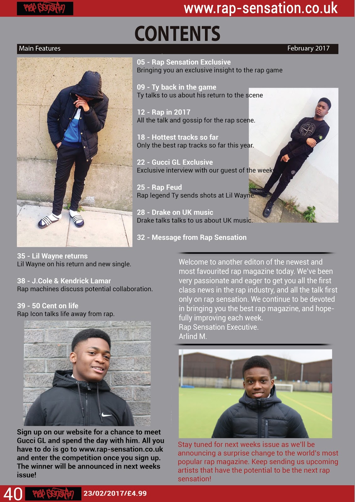
Contents page:


